The great list of microaggressions and their context
"You're Chinese, right?" In Elementary school, a lot. Also, when I went to my friend's house her mom said that, and she was asian was well.
"No, what's your REAL name?" This is less common, but happened in elementary school, but only by the girls. My guy friends never said anything like that.
"你会说中文吗?" I get this a lot when I'm in the subway, airport, or anywhere near Times Square or Chinatown. Do I look Chinese? I'm Vietnamese.
"You must be adopted." Well, I am adopted, but just because I'm Asian and I speak English doesn't mean I'm automatically adopted.
"How long have you been living here" This is an irritating thing people on vacation in America ask, especially the Asian visitors.
"do you speak English?" This is kind of my fault, but it's also the other side's fault. I go to Kinokuniya and Book Off a lot and I get this a lot. Everyone asks me if I speak English even though I'm in the English Manga section. I kind of understand this when I'm in the Japanese Manga section at Kinokuniya, but they say it REALLY slowly. I'm pretty sure they think I'm Japanese. Do I look Japanese?
"It's was your birthday yesterday, did you have Asian food?" Sure, I like Asian food but don't just think I eat Asian food. Actually, this year I had Italian food for my birthday.
"I wish I had your hair, it's so dark" Thanks, I guess. I mean, a lot of people want my hair.
"well, of course you're good at math"
"It makes sense you're not good at English"
"I love your way of life. I'm totally Buddist"
"What's your first language"
Monday, April 27, 2015

Thursday, March 12, 2015
Pretty...sure, let's call it pretty
 This
one is formatted into panels (like in a comic). It is interesting that
Vol. 2 is in a modern type and the editor's name is in a speak bubble.
Another interesting design choice that really pulls the cover together
is that the title is in the margin.
This
one is formatted into panels (like in a comic). It is interesting that
Vol. 2 is in a modern type and the editor's name is in a speak bubble.
Another interesting design choice that really pulls the cover together
is that the title is in the margin.  I found it interesting that I instantly knew it was Batman, despite
there being no words on the cover. What pulled me in was that Batman
had this really creepy smile and looks like he hasn't shaven in a few
days.
I found it interesting that I instantly knew it was Batman, despite
there being no words on the cover. What pulled me in was that Batman
had this really creepy smile and looks like he hasn't shaven in a few
days.


Wednesday, March 11, 2015
I swear, it's like stockholm syndrome.
Can't choose!! Styxx and Acheron are my favorite books (and choosing which brother is better is mean)
For Acheron the book has the character's personal symbol on it. For someone that likes the series it pulls them in, and the simplicity of the cover does not put off any new readers.
Styxx on the other hand has a dark and depressing feel (because of the purple and black) and the phoenix gives impression that the character will overcome something.
I may like Styxx a bit better because it embodies the character (Styxx) better than the cover of Acheron. Also, I pity Styxx more so I can't be non-bias.
For Acheron the book has the character's personal symbol on it. For someone that likes the series it pulls them in, and the simplicity of the cover does not put off any new readers.
Styxx on the other hand has a dark and depressing feel (because of the purple and black) and the phoenix gives impression that the character will overcome something.
I may like Styxx a bit better because it embodies the character (Styxx) better than the cover of Acheron. Also, I pity Styxx more so I can't be non-bias.
 |
| Acheron: like physically and emotionally abusing a puppy |
 |
| Styxx: like raping a baby seal. over and over again. |
Wednesday, February 25, 2015
Fencing team logoooooooo
1. Answer the following questions and be specific and use design language:
Tip: Take a screen shot of your presentation board since most of your projects are so large.
Press SHIFT+COMMAND+4 - your mouse cursor will change and you can select the area you want to take a snap shot of your screen. The image will be on your desktop.
Shift+Command+3 takes a photo of the entire screen.
1. The most challenging aspect of creating my logo design was that the computer was constantly shutting down, and that the memory would be erased almost every day. Saving it to my flash-drive would sometimes work, but if I had a reference picture on the .ai it wouldn't show up the next time. I feel the phoenix was the most impressive part of my logo. This is because I came up with it quickly and I spent a lot of time on it's symmetry.


- What was the most challenging aspect of creating your Logo design?
- How did you overcome the challenge?
- What was the most successful aspect of your Logo design?
Tip: Take a screen shot of your presentation board since most of your projects are so large.
Press SHIFT+COMMAND+4 - your mouse cursor will change and you can select the area you want to take a snap shot of your screen. The image will be on your desktop.
Shift+Command+3 takes a photo of the entire screen.
1. The most challenging aspect of creating my logo design was that the computer was constantly shutting down, and that the memory would be erased almost every day. Saving it to my flash-drive would sometimes work, but if I had a reference picture on the .ai it wouldn't show up the next time. I feel the phoenix was the most impressive part of my logo. This is because I came up with it quickly and I spent a lot of time on it's symmetry.
Tuesday, February 24, 2015
I want a time machine!!
Ok. This week went SO fast!!
This was my itinerary.
Friday: School. Slightly sick. Got home and watched Ergo Proxy.
Comments: I swear, I've been sick constantly lately. But I am so happy I started watching Ergo!! This weird ass future with a government just slightly more corrupt than our own was the most thought provoking anime I've watched in a while.
 Saturday: Singles awareness day, so lets watch The Imitation Game.
Comments: Bad enough I saw all these couples all happy in the streets, but then I saw a movie with people smarted than me. Who am I kidding, this was a great movie!! Alan Turing is such an interesting person and Europe is such a dick!!
Sunday: SAT prep.
Comments: it is painful. so much vocabulary.
 Monday: Going to Sake.
Comments: Linda's brother said he was a bottomless pit, but each girl there ate more than him!! Also, we learned not to order again until everything comes. I was on the verge of a food induced a coma, and I SUFFERED!! Still, super tasty food. I got to eat tamago!!

Tuesday: Practice SAT at A-List.
Comments: Every f*cking week. I want to DIE. I have time and a half so I'm in a small room for FIVE hours.
Wednesday: American Sniper.
Comments: The patriotism is approaching Micheal Bay Level, and the xenophobia is right up there with COD. Made me want to play some Call of Duty: Modern Warfare 3. AMERICA!!


Thursday: More SAT prep and The Theory of Everything.
Comments: I can't wait until March, no more SAT (unless I get a less than desired score)!! Oh, and The Theory of Everything was great.
Friday: Community Service for 2.5 hours, and fill up a pink cup from 16 Handles for $4
Comments: Community service to make myself look like a good person. But the only thing moving
me through the day was the promise of 30oz. of frozen yougurt.
 Saturday: Fencing practice.
Comments: Private fencing is great, but the warm up takes up 1.5 of the 2 hrs!!!
Sunday: Another Practice SAT
Comments: When will it be March?!?!
This was my itinerary.
Friday: School. Slightly sick. Got home and watched Ergo Proxy.
Comments: I swear, I've been sick constantly lately. But I am so happy I started watching Ergo!! This weird ass future with a government just slightly more corrupt than our own was the most thought provoking anime I've watched in a while.


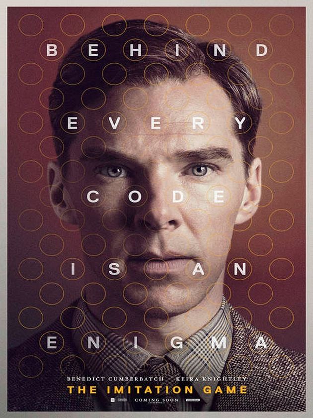 Saturday: Singles awareness day, so lets watch The Imitation Game.
Comments: Bad enough I saw all these couples all happy in the streets, but then I saw a movie with people smarted than me. Who am I kidding, this was a great movie!! Alan Turing is such an interesting person and Europe is such a dick!!
Sunday: SAT prep.
Comments: it is painful. so much vocabulary.
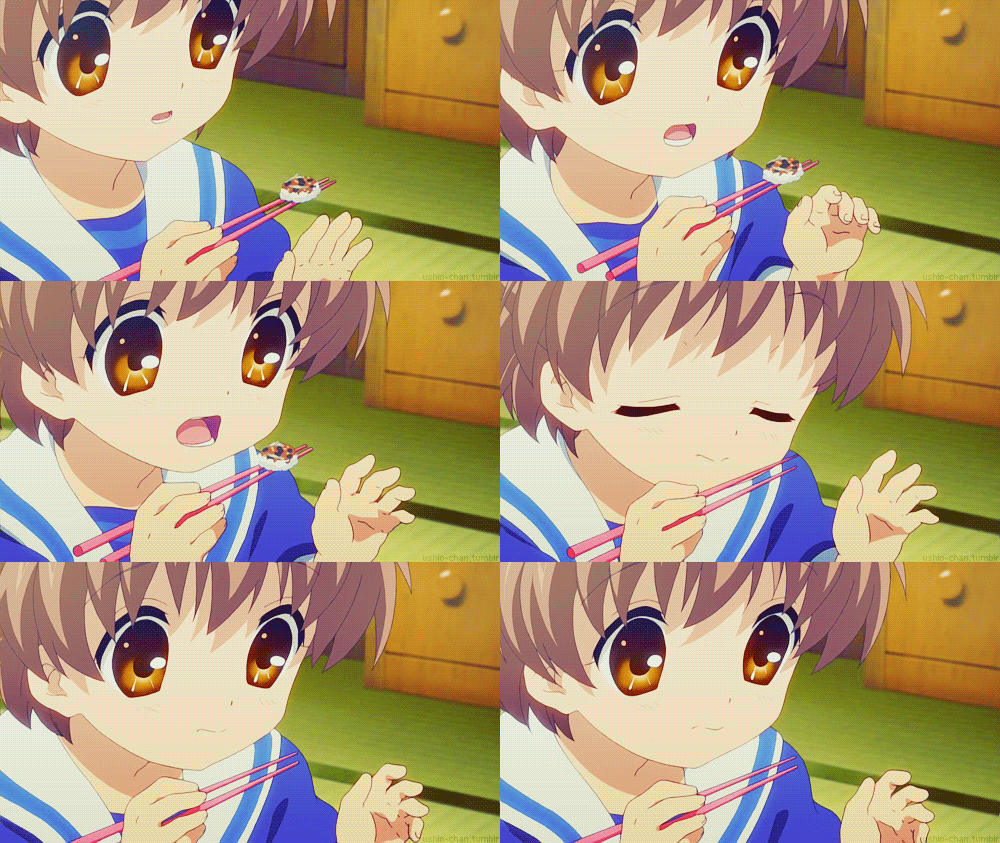 Monday: Going to Sake.
Comments: Linda's brother said he was a bottomless pit, but each girl there ate more than him!! Also, we learned not to order again until everything comes. I was on the verge of a food induced a coma, and I SUFFERED!! Still, super tasty food. I got to eat tamago!!

Tuesday: Practice SAT at A-List.
Comments: Every f*cking week. I want to DIE. I have time and a half so I'm in a small room for FIVE hours.
Wednesday: American Sniper.
Comments: The patriotism is approaching Micheal Bay Level, and the xenophobia is right up there with COD. Made me want to play some Call of Duty: Modern Warfare 3. AMERICA!!


Thursday: More SAT prep and The Theory of Everything.
Comments: I can't wait until March, no more SAT (unless I get a less than desired score)!! Oh, and The Theory of Everything was great.
Friday: Community Service for 2.5 hours, and fill up a pink cup from 16 Handles for $4
Comments: Community service to make myself look like a good person. But the only thing moving
me through the day was the promise of 30oz. of frozen yougurt.
Comments: Private fencing is great, but the warm up takes up 1.5 of the 2 hrs!!!
Sunday: Another Practice SAT
Comments: When will it be March?!?!
|
| I'm being repetitive because taking practice SATs is as well |
Tuesday, February 3, 2015
Let's see art over the break!!~puru
So, me and my friend Abigail went to the MET over the break (it was Monday) to see all the mourning outfits and all the pretty paintings, jewels, furniture, and stuff. We walked through the European painting because that's always fun.
Anyway, I saw a bunch of really pretty painting that I liked. Diana and Cupid by Pompeo Batoni was really captivating, but my favorites were The Storm and Springtime by Pierre-Auguste Cot. They were so enchanting, the colors so in sync with each other. In Springtime the dark greens offset the pale bodies of the girl. In The Storm they almost melt into the background, as the tans of the ground and their skin blend so beautifully. i found in Diana and Cupid the red cloth covering Diana's lower half was bright and vivid in comparison to Diana's pale skin that glows white.
Abigail and I sat there for ~30 mins just looking at it's magnificence. I like romantisim era painting because it was the end of beautiful art that tricked one into thinking the world wasn't a horrible place with bleak colors *cough* realism *cough*. In addition I despise those paintings with a dot in the middle of the canvas that goes for upwards of $1million.
Anyway, I saw a bunch of really pretty painting that I liked. Diana and Cupid by Pompeo Batoni was really captivating, but my favorites were The Storm and Springtime by Pierre-Auguste Cot. They were so enchanting, the colors so in sync with each other. In Springtime the dark greens offset the pale bodies of the girl. In The Storm they almost melt into the background, as the tans of the ground and their skin blend so beautifully. i found in Diana and Cupid the red cloth covering Diana's lower half was bright and vivid in comparison to Diana's pale skin that glows white.
Abigail and I sat there for ~30 mins just looking at it's magnificence. I like romantisim era painting because it was the end of beautiful art that tricked one into thinking the world wasn't a horrible place with bleak colors *cough* realism *cough*. In addition I despise those paintings with a dot in the middle of the canvas that goes for upwards of $1million.
 |
| Springtime |
 |
| The Storm |
 |
| Diana and Cupid |
Monday, December 22, 2014

The Game Grumps!!

Game Grumps is one of my fav shows. This is a decorative because of the 3-Dimensional look of the characters. See, it looks like it has a shadow!!
Random font post!!

Can't tell. Sekaiichi Hatsukoi (kanji) is script because of the thin and thick lines and the curves at the end of the characters. The katakana at the bottom seems to be in a sans serif because it is very "blocky" and have equal thickness in each character.
Wednesday, December 17, 2014
Favourite Logo
Create a blog post about your favorite logo(s). Name one brand/logo that you own and enjoy and explain why you think the logo is well designed. Then chose one logo that you are not familiar with from the best logo design links I have below (the first two). Chose one that you think is well designed and explain why.
My favourite logo design is that of Brooks Brothers. I enjoy it because of it's history and how it connects to so much more than an upscale clothing company. The drooping sheep originally signified the members of the Order of the Golden Fleece, a group of knights started by Philip III, Duke of Burgundy. After the fall of the order, fleece merchants started using it to signify their trade. It was eventually copyrighted by Brooks Brothers in 1818. It is so classy and sophisticated and that is why I like it.
I am not familiar with the Spartan Foundation Repair. I like how they used the Greek helmet that was worn in battle as the logo. Due to mass media and education the majority of society has a basic understanding of Ancient Greece. It is simple and fun.


My favourite logo design is that of Brooks Brothers. I enjoy it because of it's history and how it connects to so much more than an upscale clothing company. The drooping sheep originally signified the members of the Order of the Golden Fleece, a group of knights started by Philip III, Duke of Burgundy. After the fall of the order, fleece merchants started using it to signify their trade. It was eventually copyrighted by Brooks Brothers in 1818. It is so classy and sophisticated and that is why I like it.
I am not familiar with the Spartan Foundation Repair. I like how they used the Greek helmet that was worn in battle as the logo. Due to mass media and education the majority of society has a basic understanding of Ancient Greece. It is simple and fun.
It's a new post!! Photoshop pic!!
This was my old pics


CONCEPT TRANSFORMATION: SUCESS? NO SUCESS? JUST DIFFERENT?
It's just different. I didn't do anything THAT amazing. Just a new background in the Bahamas.
Tuesday, November 18, 2014
Scale gif!!!!

While using Photoshop the most frustrating aspect of the program was drawing the shapes because I had limited mobility when drawing the layers. I would have wanted to use a drawing board to draw everything onto Photoshop to make it nicer. Also having a drawing board would save me time, time that I could have used to make even more frames.
After completing the project, which tools do you feel most confident in using?
I feel that the painting is my area of specialty. This is because I was able to manipulate it to make a straight line without the straight line command.
Which tool do you wish you were better at using? Explain why?
The vast selection of select tools and all the "wonders" that it entails. This is because if I were to use it again, I must fully understand what I am doing and how to probably select.
What would you like to create next with Photoshop?
Animation with hand drawn layers edited in Photoshop.
Saturday, October 25, 2014
LOOK @ MY GIF!!!
Took me forever to learn how a person walks, but it was worth it I guess.
Sorry for no color, I tend not to color this because I draw manga.

Sorry for no color, I tend not to color this because I draw manga.
Monday, October 20, 2014
Status Symbols: Coat of Arms concept board
Coat of arms and family crests of Europe follow eight rules that cause each crest to be both similar and different. The shield is to represent the family or country’s strength, while the helmet that rests atop of it indicates the family’s rank as well as wreath that is attached to it that uses the two main colors of the emblem(not prominent in GB Coat). The top mantle is a reminder of the Crusades in which the Roman Catholic Church ordered the attack on the holy land. The crest is a decoration that was originally placed atop the the helmet in jousting tournaments. In Great Britain’s coat of arms the shield is being held by the lion and unicorn. These are the supporters. The crown above the helmet is what signifies the family’s power and rank (ie. crown for royal crown). The motto, many times in latin are either on the mantle at the bottom, wrapped around the shield. The sections of the shield represent rank as well. This is found in all European and many Middle Eastern coats. Asian coat of arms resemble family crests from clans.
http://www.historylearningsite.co.uk/coats_of_arms_heraldry.htm
http://www.internationalheraldry.com

http://www.historylearningsite.co.uk/coats_of_arms_heraldry.htm
http://www.internationalheraldry.com
Tuesday, October 7, 2014

Thursday, October 2, 2014
What inspires me?
Well, that's an odd question. Maybe I'll do some super generic and non-specific answer like: THE WORLD INSPIRES ME!!
But really, anything can inspire me, and with an attention span on the same level as a squirrel I can find a faint interest in something as random as a speck of dirt.
I get a lot of my inspiration from random things that pop up in my mind. If I am reading about Greek mythology, I can suddenly come up with a storyboard for the child of Persephone and Hades.
I never outgrew that imagination that most kids have when they are five, so I guess that helps.
YAY ME!!!!
Bye bye ~puru
Monday, September 29, 2014
Letter Project Reflection
1. When starting the letter project I immediately started by thinking "outside the box" by thinking of not only the latin alphabet. I wanted to use a letter that had more meaning to it than just spelling. After picking the letter Δ (delta) I decided to think about cycles and changes, as that what the letter Δ (delta) stands for. I found that choosing a letter first was very helpful because in my experience the letter needs to be represented in the letter, and vise versa.
2. I picked the letter Δ (delta) because it signifies change, and I am constantly trying to change myself for the better. I thought of things that change and came up with two ideas: flowers and life. After narrowing it down to two ideas I picked flowers because my true given name, Mai (梅), is translated to apricot blossoms in means apricot blossoms in Vietnamese. I represented the idea of apricot blossoms changing with the seasons by drawing them in three different parts of their life cycle: late winter, spring, and summer. This represents my idea of change because the flowers represent the changing season and the change in myself.
3. The most challenging part of the project for me was coloring it. I tend to draw in black and white because I draw manga, so changing to color threw me though a loop. When I shade I use hatching and cross hatching because it is a simple way to create volume without too much hassle. Changing to color and having to use different pressure to draw was jarring.
4. I am satisfied with my project, but just barely. I would have loved more time on it to really make the colors pop. I would have also liked to conduct more research in how to draw flowers. The flowers look very 2-dimensional and it bothers me a bit.
5. If I could change something about the design, I would make the girl look more human and less like a manga character. I want to learn how to draw more realistic people, or at least more Berserkesque.
 |
| A drawing of the fictional ship The Seahorse from Berserk. All shading done with hatching or screen tones |
 |
| Just starting to color |
 |
| Almost done coloring |
Thursday, September 11, 2014
Mai tells a story
Hi hi!!! My name is Mai (later changed to Alison against my will), and I'm in graphic design!!!
I'm a shut-in that spends all her time either playing videogames, drawing manga, watching tv, or sleeping (づ。◕‿‿◕。)づ GO ME!!
Anyway, story time! I made this up because to restate, I am an Otaku shut-in with no life so making stories up is part of the "disease".
Once upon a time there was a child that lived in an imaginary world. The world was filled with wonders and grand spectacles that filled her eyes with folly. Grand gates locked her path to the human world, a world that was filled with ominous mysteries. She was happy living in her imaginary world, except for one flaw: there was no people to talk to. She had the rabbits, the deer, the magical creatures and apricot blossoms to talk to, but no people.
One day she heard a voice that she never heard before, and she decided to follow. She chased it through the field of fairies, the den of dragons, and the sands of Spynxs to the Great Gates. Then the voice spoke to her, telling her she could live in an eternal wonderland. The girl responded But I'm already in wonderland, can you not see all my friends? She smiled and began to skip away. The voice hollered Wait! This wonderland has people like you, in a shapes and sizes. You must be curious about the world now! So come with me! Leave this half rate wonderland and travel to the REAL WORLD the real wonderland. The girl became intranced by the voice and began to open the closed gates.
Her friends screamed to her it's a trap! The forest animals and fairies ran at her to pull her back only to hit an invisable wall. The wise spynx roared Don't leave! If you leave now you will never be able to return to this place! I'm begging you...don't leave us alone! The girl turned her head back, only after walking through the gates, and began to cry.
Subscribe to:
Posts (Atom)